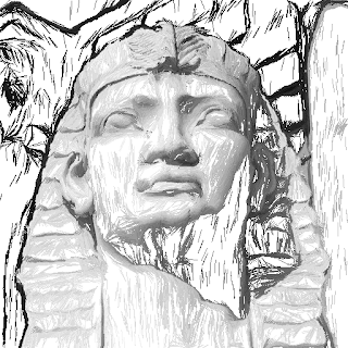
Choose a threshold of gradient magnitudes and densely draw short straight lines for each pixels. Since we do not care how many stitches, gradients decide the boundaries nicely. Then maybe we can think about the inner directions to have some contrast.Have to find a way to distinguish three contents: background, texture, and smooth parts.I am thinking to interactively define them if we cannot find an automatic way in a short time.


This is an extremely compelling painterly effect. The German portrait, in particular, strongly resembles the Hertzmann images from his 1998 paper.
ReplyDeleteLayering this on top of a coarser rendering of the image would be the conventional way of addressing the gaps. The gaps are pretty good though -- right now they give the images a lot of their charm.
Tinkering with color and opacity of the strokes is another direction. This would move more in the painterly direction than towards drawing or embroidery, though.
There is a paper on texture enhancement by Kartic Subr that might provide some insight into texture segmentation, if that is what you are keen on.